
Community Impact Tāmaki Makaurau
Service
Brand Strategy
Deliverables
Logo Design, Visual Identity, Brand Guidelines, Conference Collateral
Industry
Public Good
Duration
8 – 9 Weeks


ABOUT
Bringing Tāmaki Makaurau together
Community Impact Tāmaki Makaurau brings together community partners, mana whenua, Auckland Council, funders, practitioners, government agencies, and leaders to learn from collective action and shape the future of Tāmaki Makaurau together. The forum creates space for wānanga, connection, and collective action, exploring how communities can strengthen belonging, resilience, and wellbeing for generations to come.
The brand needed to reflect this spirit of connection — bringing together diverse communities while feeling welcoming, contemporary, and distinctly grounded in Tāmaki Makaurau.


APPROACH
Designing for connection and belonging
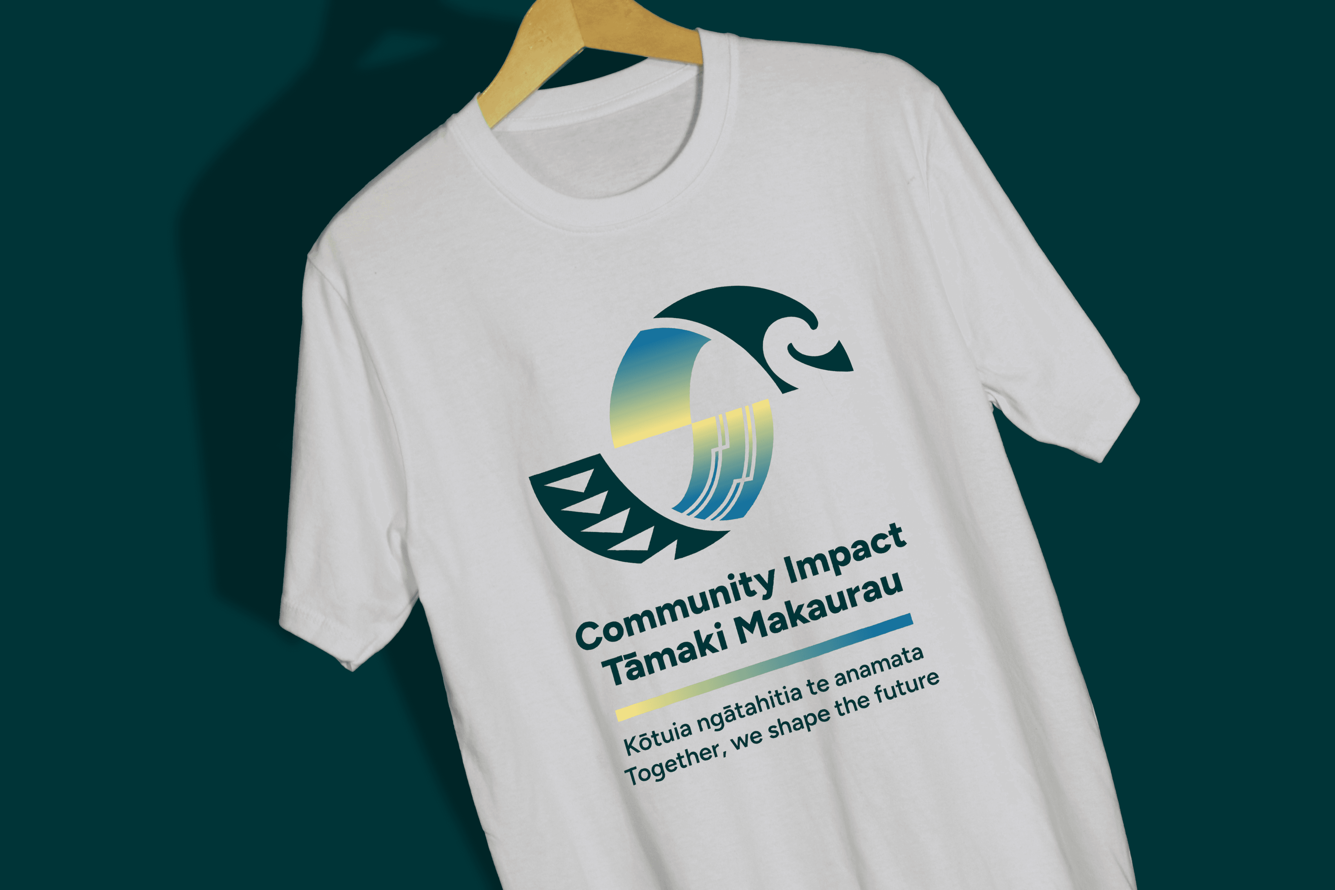
We developed a visual identity grounded in the four key demographic communities of Tāmaki Makaurau: Tāngata Māori, NZ European, Pasifika, and Asian communities.
Through several weeks of wānanga-ki-ipurangi, the tohu evolved from early concepts into a distinctive symbol and wordmark. Each element draws from cultural visual languages while contributing to one unified identity — reflecting the diversity of communities that make up Tāmaki Makaurau.
The result balances cultural character with approachability, creating a brand that feels community-focused rather than corporate.


SOLUTION
Created space for wānanga, connection, and shared learning
We developed the event programme, session graphics, presentation assets, signage, digital communications, and supporting collateral, giving the forum a consistent and recognisable presence from registration through to the day itself. The visual system was designed to remain flexible across different formats while keeping the focus on people, kōrero, and connection — supporting a programme that brought together diverse voices from across Tāmaki Makaurau.


OUTCOME
A vibrant identity for collective action
The resulting identity is fresh, natural, and uplifting, with a colour palette inspired by coral, teal, sun yellow, and ocean blue.
Bright yet balanced, the palette brings warmth and energy to the brand while creating a sense of trust, belonging, and possibility. The flexible symbol and wordmark system is designed to work across digital and physical applications, giving Community Impact Tāmaki Makaurau a recognisable presence for its forum and future initiatives.
A brand designed to bring people together, celebrate diversity, and create space for positive change.


